Research Thursday 11th May 2023
LO: To research codes and conventions of similar products
1)Create a front cover and double page spread article for a health and fitness magazine aimed at an audience of primarily 14-18 yr olds.
1)They all talk about getting fit/getting in shape etc. They talk about workouts and diets.
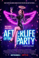
2)The front cover features either a fit model or a fit celebrity, someone who visibly has a lot of muscle.
3)Mostly pink/lighter colours on the Women's magazines sometimes reds to make the women seem more sexy and desirable and blacks and reds on the mans magazines. The darker colours on the mens magazines is to make them seem more manly or sexy in a way, the lighter pinks are to make the women seem sweeter or more desirable.
4)The masthead is at the top and is big in a bold font sometimes covered by the main image.
5) There is one singular image on the front cover, this is the celebrity or model.
6)There is multiple cover lines maybe about 4-5 but sometimes more depending on the magazines some have double that, some have less.
7)The barcode, price etc. are usually placed in a bottom corner.
8)Many fonts are used, usually similar fonts, the Masthead is usually in bold and is the biggest writing on the cover, the main cover line is the next biggest, still usually in bold, a different font to the masthead tends to be used for the main cover line, the cover lines are smaller and again a different font might be used. Things like websites, price etc. are usually really small and out of the way.
9) A puff is sometimes used and commonly, the puff is in a circle to the side of the main image, the background of the puff usually follows the colour scheme.
10) Two coulombs of writing down each page, images are usually in the corners so that writing can be placed around the edge
11)There is usually a few images on a dps, maybe 2 0r 3
12) Usually about 2. The smaller writing usually has the same font and the titles etc. might be in a different font.
13) The text goes down the first page and then the second like normal but they have 2 Coulombs where the writing is split in two, like in a news letter, there is four separate coulombs of writing on the double page spread.
1)They use the same kind of font style and images (muscly men) and they use the same colour palette on the front cover and the double page spread.
2)It looks like it could have a mid production value-Images shot in a studio but it looks more like paper, not glossed over but it does look pretty thick.
3)They focus on getting fit to have a nice body, summer body etc. They focus on strength and power not the thought of getting fit to keep you healthy or for your mental health. The images on the front are an unrealistic expectation for most people-they focus on the long term goals of fitness. They almost sexualise people and sexualise fitness in a way because they talk about having the perfect body. Look after your body. Promoting a healthy lifestyle and extended youth.
4) They usually use the same colour scheme palette as the front cover but on a lot of magazines, they use different colours for each dps.
5)The people are represented as fit, strong and desirable, the focus is mainly on the abs and sometimes the arms, showing off a visible 6 pack.
6)The target audience is usually young adults, it appeals to them by putting an image of a young adult on the front cover, they talk about going to the gym ect which might not be accessible to older or younger people, they talk about young people's fitness journey's
7)They use the same colours and mention the same topics and people as they do on the front cover, sometimes the name of the magazine is written in small at the top of the page, maybe in the corner or they could have a topic mentioned in the corner that was mentioned on the front cover.
1)They might use a similar colour palette or a similar font type to that which was featured on the front cover.
2)It looks like it could have a high production value-it looks like it could have a glossy cover, the images look like they've been taken in a studio, it looks pretty thick like it has a lot of pages as well.
3)To lose weight, to be self motivated to stay fit and healthy, to 'Tone every inch!' quick transformations, to look after your body. Promoting a healthy lifestyle and an extended youth.
4)They use a similar colour palette to that used for the puff on the front cover, sometimes a similar font type to the ones used on the front cover.
5)The woman on the front of THIS magazine is represented as more of a motivator because everyone wants their bodies to look like hers and there are topics used such as self motivation, stress, the mental struggles of keeping fit etc and it says 'Fit tips from a supermodel' this makes her seem like she's guiding you to find that same strength to keep fit and look like her or something.
6)It appeals to young women, i does this by having an image of a young female on the front cover as well as using language like 'slim' and talking about the mental health side of fitness and the struggles witch typically you wouldn't find in a males fitness magazine, it talks about work stress and personal trainers which typically children and elderly don't have. The font type i think would appeal more to women than men.
7) You can tell that they come from the same magazine because they feature the same topics effective workouts, weight loss and how to lose weight and look slimmer quicker with a selection of different activities. They also use a similar colour palette and a more feminine font type.
Put it all together:
Pastel colours, limited writing in a range of different fonts, female images, the main image doesn't cover very much of the masthead. A mix of italics and bold font types, a variation of different font types. Female image (fully clothed because its a kids magazine, topics of sport etc. that younger people might be interested in). Pastel/bright coloured masthead in a bold font, cover lines etc. scattered around not in any articular order around the outside of the main image. Feature topics of spots and mental health, maybe talking about how to fit fitness and sport in around school and exams, talk about how a good sleep schedule and regular water consumption can be really beneficial to your health and fitness as a young person, self love and body dysmorphia, realistic expectations. Bright maybe pastel colour palette. Multiple images on the double page spread which are relevant to the topics features on the dps. Italic fonts used on the dps, lots of key pieces of information highlighted, lots of colour.
Planning
LO: To plan an effective product aimed at a specific audience using appropriate codes and conventions.
- Pastel/bright colours-pinks, oranges, reds, yellows ect.
- serif font/script, fancy, interesting fonts-italics
- Masthead in a big bold font in a brighter, more prominent colour
- Image of either gender, teenager/young person because its a children's magazine
- Less writing maybe inside of a shape, bright colours, important bits highlighted,
- healthy sleep schedule, drinking, healthy/unhealthy eating habits, fitting health and fitness in around school and social life
- still less writing on the dps, lots of pictures, lots of bright colours
Name-Health-Hit
Tagline-First class health and fitness
House style- younger person who doesn't have the perfect body but is still smiling happy and content with their fitness. Very colourful, variation of different colours, limited writing.
colour palette-light blues and greens and pastel purples.
cover image ideas- Young teenage, not professional, normal body, doing an active activity, body positivity.
Cover lines- Turn your weekends into an adventure, how to keep a good sleep schedule, how to squeeze fitness into your busy schedule, cut out your unhealthy eating habits, be more self motivated.
Info to include- Barcode, date,
DPS Article subject-The importance of a good sleep schedule and drinking a lot of water& the effects of it.
DPS Image ideas-


Sometimes a visual representations of things like mind maps and pictures makes stuff easier to understand for some people, only the key information is shown on these images
DPS Layout ideas-images run down the middle by the fold with writing on either side.
Representations- Represented as real, imperfect (enforcing that nobody's perfect). Young. Healthy.
how to make it appeal to the target audience- Bright colours, relevant topics, box each coverline off/space them out, use little writing on the cover and less writing on the dps using mostly the key information. Using a relevant main image and relevant topics.
The importance of sleep-
The importance of drinking a lot of water-
Headline-Health basics
Images, someone drinking, maybe like a really colourful mind-map with all the key bits picked out.
Notes- The importance of sleeping, how that effects you in day to day life, the importance of drinking and staying hydrated in day to day life, keeping up you calories when your exercising, making sure you are eating enough to burn it all off.
Design elements- include numbers and drop caps, include a slightly different colour palette from the front cover but only a little bit different, subheadings and sections- each section of my notes has its own section numbered.
Standfirst- To keep nice and healthy you might need to fix your sleep schedule, keeping hydrated will help you stay healthy and help clear your pores and reduce acne, glow ups, keep fuelled up especially when you're exercising, don't burn off too much- eat enough to burn off and stay fit.
Adobe Illustrator
LO: To explore the use of illustrator to create a magazine, masthead or logo.
Target audience: Thursday 29th June 2023
LO: To research our target audience to enable successful Targeting
Target audience-
age-14-18
Gender-Doesn't matter
income/job- no job or part time to fit around school, low income
race- Doesn't matter
education- in secondary school or college- GCSEs or A levels
interests- Getting fitter, being healthy, getting rid of bad habits, likes being active,
In-Design
LO:To explore and understand how to use InDesign for magazine layouts
Thursday 7th September 2023
Statement of intent
LO: To produce a concise and clear statement

My Brief is to create a Health and Wellbeing magazine that focuses on 14-18 year olds. My magazine's name is 'Bringing fitness back to life'. I plan to make my magazine colorful with a palette of bright, interesting colors, pastel colors. I want my magazine's cover to have a sparse amount of writing, more pictures, which is something that appeals to my target audience. The main image will be of a younger person, not a model with a perfect body that reflects unrealistic expectations of real health and well-being. My particular target audience is young teens who are active and passionate about a healthy lifestyle and focus more on irradicating bad habits that will help you stay healthy, I will do this by featuring topics related to people of this age group on my DPS, such as: The importance of sleep and setting your sleep schedule, and to keep hydrated to stay healthy and clear for pores, I will also use images to demonstrate. Many other magazine companies use bright colors on the front of their magazine, this helps draw people to their magazine, makes them stand out, uses different fonts just on the front cover, making the cover look more attractive as well as less boring to read. I will try to use the same number of photos of both genders so that my magazine appeals to a larger range of people rather than just gender. I will be challenging the stereotypes of generic fitness magazines by not focusing on things like strength and power, many health and fitness magazines focus on exercise to get a nice summer body or to look more desirable, focus on strength, power and body image rather than exercising for your physical and mental health. The unrealistic expectations of body image are not what my magazine will promote for young teens, and this challenges common, stereotypical health and fitness magazines
Coursework review
LO: To recap brief criteria and to explore how to create effective representations.
How is your cover going to follow the layout conventions of a front cover?
It will have a single main image with a masthead at the top, cover lines surrounding the main image and all of the others features of a magazines in the correct places. i will use a colour palette of 2-3 colours and my main image will feature something that links to fitness.
What is your DPS about and how will it be laid out?
My DPS will be about the physical health of your body and cutting out bad habits ect. Such as drinking lots of water, sleeping, cutting out meals and keeping to a routine, things that are relevant to teenagers, they often struggle with things like that. I might use a diagram of a body and highlight the areas that those bad habits effect e.g. not sleeping the brain. Not about gaining muscle and getting fit, explaining how cutting out bad habits can benefit your body and physical appearance.
How will the genre of your magazine be made clear over both pages?
The genre will be made clear because of the main image, masthead, slogan and topics featured throughout the magazine.
To do list:
means i could do it at home
- Make my cover more colourful
- take photographs (someone drinking, draw a diagram of each part of the body ect.)
- Write article
- Come up with good headings for each topic
- Make a layout for my DPS
- research the topics
Magazine cover lines:
Cutting the bad habits: Changing your habits to benefit your health.
Cover-Pic of someone stood in front of the bikes.
DPS-Pic of someone drinking and a pic of someone sat at a table working with a bottle of water, someone filling their bottle up, pic of someone on a bike or treadmill.
Thursday 2nd November
This would fit with the whole article so i can just put it wherever it fits
I could use this as the main image because it matches the topic of my DPS whereas my other one didnt
Fit this in somewhere where it talks about more active people needing to drink more water.
This would fit in just about anywhere in the text so put it wherever it fits.
keep joints lubricated, prevent infections, deliver nutrients to cells, and keep organs functioning properly. Being well-hydrated also improves sleep quality, cognition, and mood.
Your body depends on water to survive.
- If you don’t like the taste of plain water, try adding a slice of lemon or lime to your drink.
- Drinking water may also contribute to a healthy weight-loss plan. Some research suggests that drinking water can help you feel full.
- Without enough, you may experience irregular bowel movements, gas, bloating, heartburn,
- Hydrating with plenty of water supports your own powerful, built-in detox processes and can help enhance your overall health.-Skincare


RESEARCH:
ReplyDeleteExcellent and detailed research and analysis. -well done!
TA PROFILE:
missing
PLANNING:
A great start - was that your final masthead design?
Love your ideas for targeting teens